Tuesday, February 25, 2014

Outliers Can Be Important Too

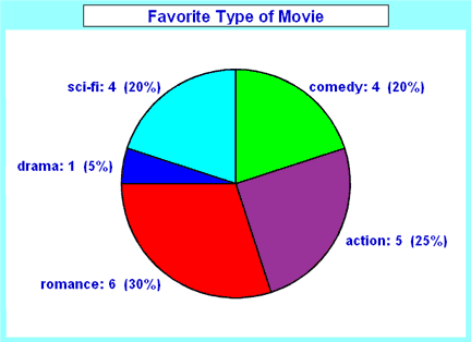
A value that "lies outside" (is much smaller or larger than) most of the other values in a set of data.
Outlier
For example in the scores 25,29,3,32,85,33,27,28 both 3 and 85 are "outliers".

 
If you plan to go on vacation, you would probably not want to go to the edge of a volcano.  
It's much too hot there.  The mountains have a much cooler breeze.

Stem and Leaf Diagram

Data can be shown in a variety of ways including graphs, charts and tables. A Stem and Leaf Plot is a type of graph that is similar to a histogram but shows more information. The Stem-and-Leaf Plot summarizes the shape of a set of data (the distribution) and provides extra detail regarding individual values. The data is arranged by place value. The digits in the largest place are referred to as the stem and the digits in the smallest place are referred to as the leaf (leaves). The leaves are displayed to the right of the stem. Stem and Leaf Plots are great organizers for large amounts of information.

Box and Whiskers

There are 5 components to finding box and whiskers solution:
Upper Quartile - is the data values that occur after the median and are in order.
Lower Quartile - is the data values that occur before the median and are in order.
Median
Interquartile Range - the difference between the upper and lower quartiles.
Lower and upper extreme - the lowest and highest number in the quartiles.
 

Pictograph

Pictograph-use a variety of graphs to display data and explore relationships between the data.
Materials- 5 apples, 4 bananas, 6 pears and 6 pineapples
This is a fun way to show categorical data and is very useful with younger students and special needs students.
 

Bar Graph vs Histograph

There are two differences, one is in the type of data that is presented and the other in the way they are drawn.  In bar graphs are usually used to display "categorical data", that is data that fits into categories.
 Histograms on the other hand are usually used to present "continuous data", that is data that represents measured quantity where, at least in theory, the numbers can take on any value in a certain range.   The difference in the way that bar graphs and histograms are drawn is that the bars in bar graphs are usually separated where in histograms the bars are adjacent to each other. This is not always true however. Sometimes you see bar graphs with no spaces between the bars but histograms are never drawn with spaces between the bars.

Pie Chart

Pie Chart - A special chart that uses "pie slices" to show relative sizes of data.

Imagine you just did a survey of your friends to find which kind of movie they liked best.
Here are the results:     Favorite Type of movie:  Comedy-4, Action-5, Romance-6, Drama-1,
It is a really good way to show relative sizes: it is easy to see which movie types are most liked, and which are least liked, at a glance.
First, put your data into a table (like above), then add up all the values to get a total:
4+5+6+1+4= 20
Next, divide each value by the total and multiply by 100 to get a percent:
 4/20=20%  5/20=25%   6/20=30%   1/20=5%  4/20=20%   TOTAL 100%
Now you are ready to start drawing!
Draw a circle.  Then use your protractor to measure the degrees of each sector.Color with different colors.
Pie Chart Example

Mean, Median and Mode

Find the mean, median, mode, and range for the following list of values:
                           13, 18, 13, 14, 13, 16, 14, 21, 13 
         The mean is the usual average, so:

      (13 + 18 + 13 + 14 + 13 + 16 + 14 + 21 + 13) ÷ 9 = 15
    Note that the mean isn't a value from the original list. This is a common.
    The median is the middle value, so I'll have to rewrite the list in order:
      13, 13, 13, 13, 14, 14, 16, 18, 21
    There are nine numbers in the list, so the middle one will be the(9 + 1) ÷ 2 = 10 ÷ 2 = 5th number:
      13, 13, 13, 13,14,14, 16, 18, 21
    So the median is14.
    The mode is the number that is repeated more often than any other, so13is the mode.
    The largest value in the list is 21, and the smallest is 13, so the range is 21 – 13 = 8.
      mean:15       median:14       mode:13       range: 8