Pie Chart - A special chart that uses "pie slices" to show relative sizes of data.
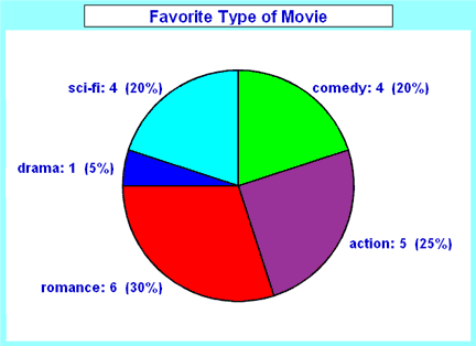
Imagine you just did a survey of your friends to find which kind of movie they liked best.Here are the results: Favorite Type of movie: Comedy-4, Action-5, Romance-6, Drama-1,
It is a really good way to show relative sizes: it is easy to see which movie types are most liked, and which are least liked, at a glance.
First, put your data into a table (like above), then add up all the values to get a total:
4+5+6+1+4= 20
Next, divide each value by the total and multiply by 100 to get a percent:
4/20=20% 5/20=25% 6/20=30% 1/20=5% 4/20=20% TOTAL 100%
Now you are ready to start drawing!
Draw a circle. Then use your protractor to measure the degrees of each sector.Color with different colors.
No comments:
Post a Comment